3 Steps to Radically Improve Your Social Media Presence

Chart your path to social media success
Are you embarrassed to share your Instagram account? Does your Facebook page leave your visitors more depressed than impressed? Perhaps it’s time for a social media visual refresh.
Unlike a comprehensive rebrand, a refresh only updates some of the visual elements that make your brand recognizable. Examples of this may include your brand colors, imagery, and typography.

Once we agreed we needed a more consistent visual presence on social media, we kicked off the refresh. Follow along as we pull back the curtain and give you a look inside our agency and creative process while also giving you the blueprint to carry out your own visual refresh and get your social media accounts in pristine condition for 2021.
1. Start with a Moodboard
To kick off any refresh, we always start with moodboards. These collages are the most efficient way to formulate and share your vision with your team. They also serve as a visual guide you can refer back to at every turn to ensure visual consistency for your brand. We started off with three different mood boards, each embodying a different aspect of our brand.
1. Smart, Brave, Successful Women

2. Celebration, Delight, Illumination

3. Adventure, Charting Your Own Path, Fearlessness

When creating your moodboards, follow these tips for best results: avoid cliche stock images where people are looking directly into the camera or smiling too much, choose images with similar lighting, and always opt for high-resolution images.
2. Expand Your Color Palette
While many major brands are identified by color association alone (think Starbucks or McDonald’s), it can be difficult for smaller brands to consistently generate engaging monotone or duotone graphics that continue to interest their audience without becoming hackneyed.
And when sourcing stock images, finding photos that match your brand colors is a nearly impossible feat.
Therefore, we recommend establishing a subset of complementary colors and tones you can use across channels in order to maintain consistency across all customer touchpoints.
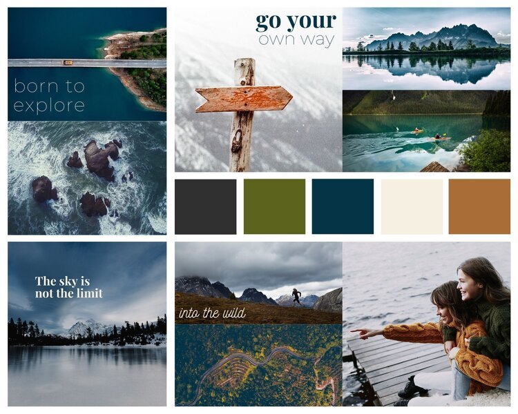
At Clover, we took our staple blue, green, and cream colors and expanded our palette by adding in an earthy orange and a charcoal. As you can see in our moodboard below, the colors are more varied, but they're all complementary and within the same tone set.

A simple way to ensure you maintain color focus is to use an online color wheel to select the color and complementary tones you like, then use that as your base reference point.
3. Set Your Type
Another way to maintain overall consistency is by choosing a few secondary fonts for your brand, setting rules for how each will be used, and sticking to that plan. For instance, we use Hypatia Sans for our primary wordmark, but on social media, we use three secondary fonts: PlayFair Display, Montserrat Thin, and Nickainley. No matter what we post on social, we never deviate from these three fonts.
We’ve also set the following ground rules for our type: PlayFair, Montserrat, and Nickainley can all be used as headings, but only Playfair may be used as body copy. We only pair Montserrat Thin with PlayFair Display or Montserrat Thin with Nickainley. We never pair Nickainley with Playfair Display and we use Nickainley sparingly to convey surprise or delight.
Now that you’ve set your type, add that to your mood board. Congratulations, you’ve completed your new look and created a guide for keeping visual consistency.
If you’d like some help bringing your new brand vision to life, get in touch! We’ve helped countless brands refresh their look and would love to help you do the same. Shoot us an email at info@clovercollective.com to set up a discovery call.